Face Ballet

old-man-head12

Okay, I’ve denied it for a long time but now I’ll come straight out and admit it: Not only is a well-designed zombie face a beautiful thing, it is a very difficult balance to achieve. Why? well, when you’re designing  and executing something from scratch you can build in some harmonies and keep these maintained as you go. With what is essentially a rotting head you’re trying to add easily-legible corruption to an object (a face) which possesses the most balanced values you could possibly think up. Its no exaggeration to say that the mind will process the faintest discernible twitch of the zygomatic minor: How, then, do you design the absence of an entire half-face to be harmonious in corruption? The aesthetics are confusing but, from Lon Chaney to Rick Baker, evidence abounds in the backlog of cinema, comics and games that such a thing is possible.

I built this fancy boy around a previously modelled skull and shrink-wrapped it (below). Only then did I decide on how to alter the form. I now have a dissectable face which could well come in handy later on.

genius3


Woody Notes

Wood demon 4

The fun involved in the eventual render more than made up for a lot of the initial hair pulling. It was more difficult than I thought to achieve the specific texture that I was after. I went through many different types of alphas and depth maps – beginning with tree bark and working my way through different types of cracking concrete and rock. The end result wasn’t the dramatic “shatter” effect I was going for, but something a little more organic. Some textures simply don’t go with certain forms, and this guy screams wood and bark. The problem with using depth maps to texture is that they will have an inherent directionality to their information – one that you might spend more time adapting to the topography of your model than if you just went in and carved it out with a brush. As usual, the key is a degree of moderation; to find a juicy alpha or depth map and then integrate it judiciously. Yes, the face is a rancor.


wood-demon-hdri

Wood demon Light Test

Designing the Gulper

And finally some decent renders of the Gulper. I wanted to make a gracile, panther-like form here. The tail betrays the design’s ultimate roots in the rod-puppet used by Gillis and Woodruff for the “beast” in Alien3 – one of my favourite creature designs in cinema. This beastie is, however, more of a pest than an actual menace. It walks on its knuckles like an ape, and I imagine it’s quite a scrambler.

Some of the prep sketches have a simian quality to them which faded in the eventual design, but I feel could be regained through animation. There are some bird-like feet in there, and also some proportional weirdnesses I’d like to have explored further. I’m always curious as to how certain avenues would have turned out.

aminals_e919c0_6420395

When it came to secondary forms I already had a scheme in mind, but was delighted to find The Red Eyed Crocodile Skink for reference. Superficially similar to the crocodilians, this little lizard has scutes with more character to them – more of a profile. They are simple, elegant forms which lend themselves to adaptation. I had some depth maps I wanted to use for the skin texture, so I wasn’t going to I ended up only using the overall pattern of the scutes, and blunted them down to give a smoother profile.

D-Maps

When it was time for “tertiary forms” I used these depth maps I made from a gumroad frog scan a while back. Using depth maps for skin texture is not as simple as slapping them on a mesh, though; to use them correctly requires morph targets, layers and careful masking. Different depth map alphas will have varying contrasts and their borders will therefore have different depths. Not only do depth maps have to correspond topologically with each other; the information they contain has to seamlessly line up. Also this information must logically correspond with its placement on the mesh (finer, shallower wrinkles and scutes on thinner skin).

The colour scheme of any model will always have a malleable relationship with the sculpt, in that both carry information in different ways. A wild, detailed paint job will obliterate a detailed sculpt, for instance. Conversely, a simple diffuse texture done well can really complement a sculpt. Finally. a simple sculpt can really be enhanced by a brave, well-executed colour scheme. I chose a colour scheme that was halfway there – very subtle where the sculpt had something to say, and a little variety where the secondary forms weren’t doing much.

And that’s about it for now. I want to write about optimising a mesh like this for real time rendering, and more about design – specifically the distribution of information around the form (even composition in general), but this one seems to be an elusive subject – there isn’t really a lot that’s readily available, even beyond the paywall.


Achieving Iterated Forms on an Organic Sculpt.

So the differences between hard surface and organic modelling will be apparent to anyone who’s tried their hand at both. Hard surface modelling rewards precision, one result of which is the ability to be modular, whereas organic modelling (“sculpting”) will have more continuity in surface area, and there need never be a repeat of forms.
Some organic designs, however, will call for a certain structural approach – even if the model you are to be left with is a contiguous surface. I’ve searched in vain for solid advice on this subject and, since I’ve learned a few approaches by trial and error, I thought I’d share some information on achieving iterated forms on an organic model. This isn’t intended to be a step-by-step guide, so if you’re a complete novice you may have to do some peripheral googling.

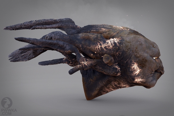
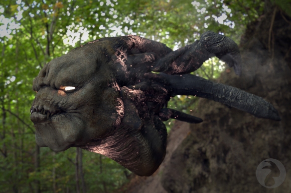
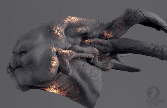
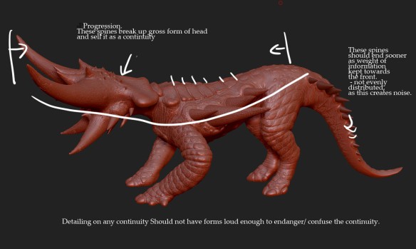
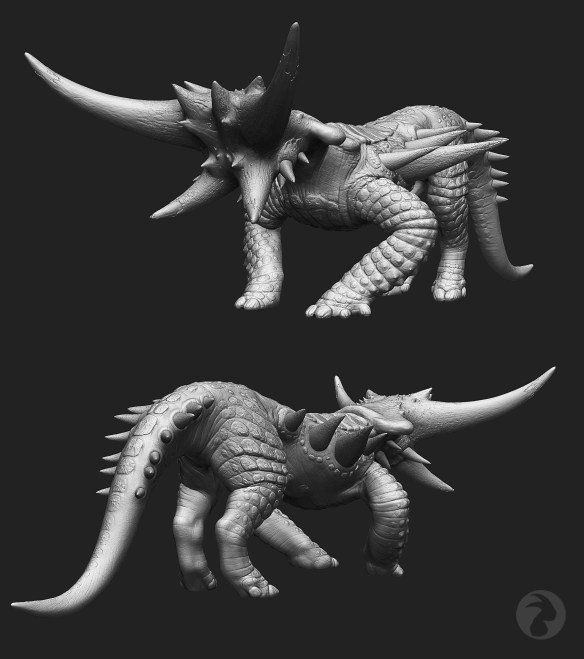
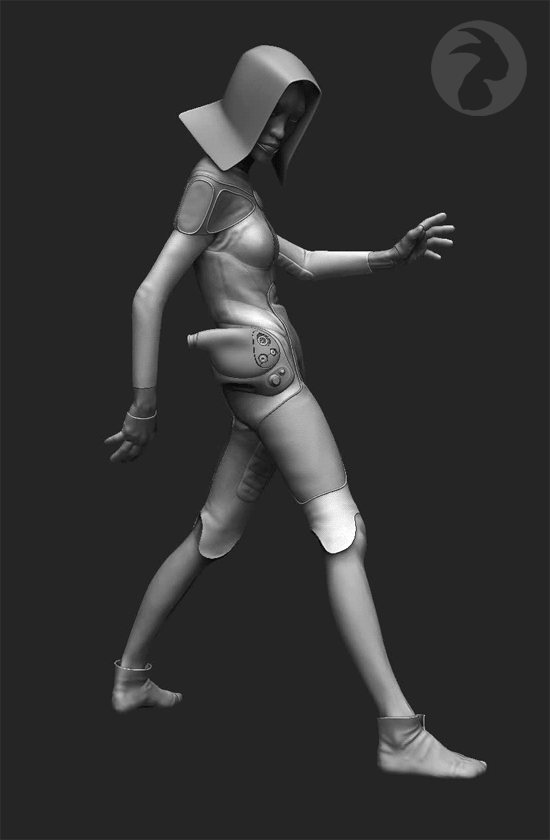
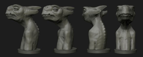
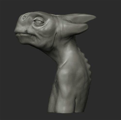
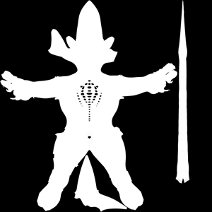
To create a second level of interest in a simple organic form is to create a hierarchy  of information within the larger silhouette, which “plays on”, or “references” this form – a structure that can be followed down to a very minute level of detail on the surface of that larger, “containing” shape. A good example of such a structure is a scute, or rigid skin detail, which features on the model above. Scutes adhere to definite rules regarding their placement, eg. on thick skin / at joints in skeleton / defensive positioning – there are obviously many more, but they will be instinctive to an observer of nature. There are less-definite rules which should also influence placement and shape, however, and these are to do with aesthetics. I’m no expert on this, but in this case its about the economy of information you employ to lead the eye from point A to point B along a series. You want to eliminate “noise” as much as you possibly can. Rules like this are really sensitive to context, and a certain amount of instinct will have to be used to decide on composition and placement. This can be a tricky subject and is itself rarely directly broached, but generally its about striking a balance between UNIFORMITY and VARIATION.

If a series is iterative, it means multiple parameters/dimensions can be changing incrementally with each expression along it. “change parameters” and “incrementally” are not terms you usually hear associated with organic sculpting, but that’s only because measurements can usually be “fudged” to a certain extent. A creature may have an underlying skeletal framework, but this is always obscured by less definite forms. In the present case, hard structural elements are to feature prominently in a design, so a certain precision is called for.

As with any methodical practice, you’re going to want to maximize the control you have over the project. In general, Maximum control means using the software to “contain” information you can keep and reuse as needed. It can get very anarchic working on a structured model like this, and a little discipline is required to maintain control. Handy “containers of information” in Zbrush include:

  • Layers
  • Morph Targets
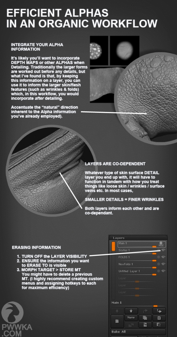
  • Mask information. This can be contained in either TEXTURES (saved out, of course) or ALPHAS (again – saved out, of course) and both types of information can be combined and built upon in a nicely structured Photoshop Document, with adjustment layers, masks etc.

These containers are powerful when used together with the two following approaches:

1. PRECISION USING MASKS

For this project I wanted to start off with the largest divisions of the form – the ones that would inform all information that was to follow. These were to be skin folds along the back, in regular intervals.

There is very limited control when you’re attempting clean lines in Zbrush, so the goal is to draw guides with the masking brush first, making sure they’re not on a layer. Now you’ll want to export these guides as an alpha. To do this, you’ll need UVs of course, but you don’t have to worry about UV layout – just hit “unwrap”, “create alpha” and export the alpha. Again, you needn’t be using layers yet, as you’ll have to merge them down to export this information anyway.

In Photoshop, use the bezier tool to draw crisp, controlled lines. If the bezier tool isn’t in your vocabulary yet, don’t worry – the lines you’ll be drawing for an application like this don’t require many anchor points. You can copy+paste these lines as necessary, changing the parameters of each curve as you go. One your curves are placed, switch up to the Brush tool and adjust its settings before you hit “stroke path”. If you need to blend layers, do so. You might want apply a slight blur, to limit the antialiasing. You can either import this file as an alpha and “Mask by alpha” or Import as texture and “mask by intensity”. Either way you should have a clean mask which you can deform as you wish.

Alpha-BackScutes2

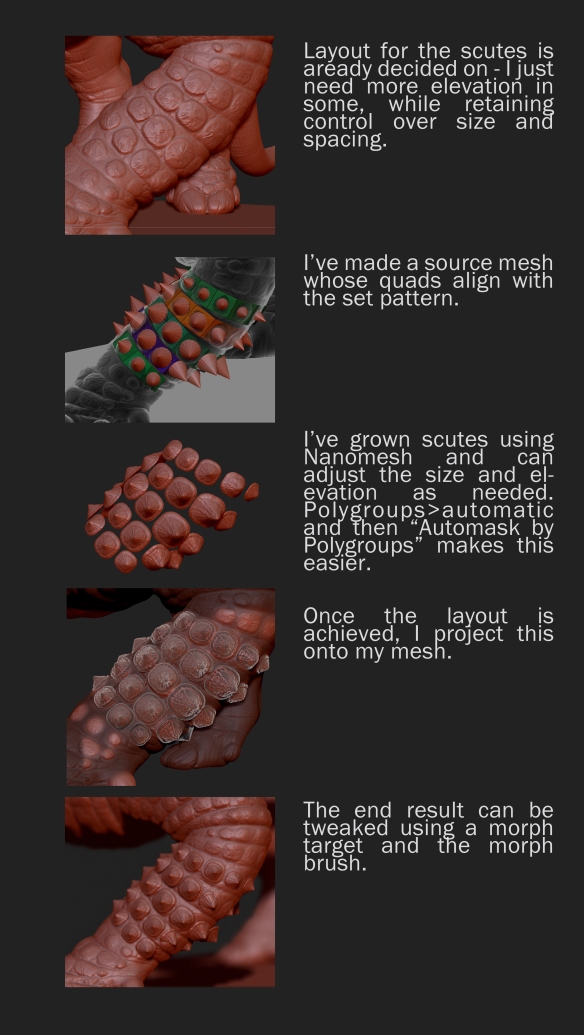
The same technique could be applied to the scutes themselves, but I prefer to see what’s happening in the ZB viewport when I can, so I start with a pretty detailed mask and a Morph target. Once I deform (inflate) the mesh using this mask, I can work back from the uniform deformation using the morph brush and a morph target – this way you can maximise your control and get the variations in height while making it much easier to have a uniform appearance. Again, its good practice to save out any mask used at any stage for any reason – you never know when you’ll need a mask again.

2. PRECISION USING MESH PROJECTION

When initially assessing a design you’ll need to know how the model should be laid out while you’re building it. Areas that will need sequences of design iterations such as those featured here should be on a defined axis (a straight tail on the Z axis, for example).

Mesh
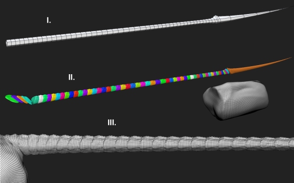
What we’re doing is building a mesh from which we can project information as desired.  To do this we are using three meshes:

  • I. Guide Mesh. 
  • II. Projection Mesh.
  • III. Sculpting Mesh.

To get a good guide mesh, you can apply a gross deformation to an initially regular mesh. You can then use edges and quads as guides for placement of the separate meshes of your projection mesh. The goal is to achieve desired progressions of width, depth and length between its edge loops. For this project I used Taper and Squeeze along the Z axis.

To build the projection mesh you can take a segment, clone it, position it and deformMeshanim 
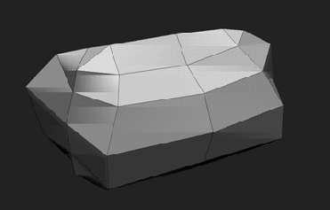
it as required. If you start from a low resolution you can keep your subdivision levels, which aid in deforming. you can merge each segment as you progress. Using the Transpose tool, change one or two parameters of each mesh along the range as you go (for instance, change both the height  and length, or change the width and height). It’s difficult to change more than one or two effectively at each pass, as you’re trying to retain a long of information in your head, but you can go back along the range and change more parameters once you’ve changed your first two.

Our sculpting mesh has the evenly spaced geometry necessary for a decent sculpt. Its the mesh we project the details of our projection mesh onto. At some point in the sculpt, you can apply a little variation, so the secondary features don’t end up too regular in appearance. This is the mesh we’ll eventually use to bake a fourth mesh, if we’re aiming for a Lo Poly, real-time rendering mesh.


Practical Skull

ANIIMATION

Here I worked back from a high resolution asset to a low resolution, practical skull model.  a lot of careful modelling and projection required, as you’re trying to capture the profile as economically as possible from a detailed, organic form.

LoRes

Onesheet Tutorials


Pwwka.com1

A tutorial I whipped up for the purposes of Pinterest interest. Must check if instagram has the same handy utility of bite-sized graphics.

Real Time

SketchFaButton

Having previously modelled Occultium only as a keyshot-worthy HiRez model, I thought I had better start to try and put something through a Physically-Based-Rendering workflow. I love how Sketchfab has gone and solved a great many of the problems with displaying 3D content online. The more I use Substance Painter, the more powerful it seems to become, and between the two I know that there is a generation of 3d Designers coming up who are going to be very, very spoiled indeed.

Organic Pattern

Prep-Terror

This is a tricky one. I’ve looked at many tutorials on the subject of creature design over the years, but I’ve never encountered one which even touched on the concept of composition in organic forms. What makes one form/series complement another to form a harmonious whole? We can leave out colour, as colour schemes can only be built upon form. Yes, there are primary, secondary and tertiary forms, but there can be more than one series of each of these, a fact which complicates the issue no end.

Organic sculpting2

The spikes are the primaries here, of course. They kind of half-segue into the back ridges, which are also very important. Normally it is easy to create a reticulated pattern on a field and to have it read as organic, as there are many ways to introduce variety – depth, size, shape etc. The problem with the scute arrangement of an armadillo is that the folds of skin which contain it are regular, creating a kind of grid pattern. A grid pattern must be handled with exteme care if it is to convey an organic substance. Even speaking of composition alone – it is more than a field of information which simple wrinkles or pores are, and taken as a whole could be seen as another primary form.

mAKINnANOMESH sCUTES4

This is a breakdown of my attempt to keep fluid and changeable as many elements as possible for as long as possible. Area, angle (pitch+yaw), spacing, shape (complexity+simplicity) and height are all variables it is difficult to juggle in two dimensions (which the surface of a model can be seen as). For this reason I used separate models for each scute in areas where I needed maximum control. To minimise confusion each is a separate polygroup which can be manipulated after generation by turning on automasking and transposing accordingly.

7

terror

Tactical Vs. Rank-and-File

kendo

With “Shinai” I wanted to ignore the practical requirements of the model, and to just enjoy the design process. No mesh streamlining, no UV-layout fretting – just design concerns. I think it was the simple technical discovery that two models can have completely different “heritage” (mesh structure, Polycount etc) and one (in fact, more than one!) and can still be used to create a Normal Map for the other.

Modelling and concepting are two different pursuits, and this model lies somewhere in between. I haven’t used the female form much, and wanted something sleek, feminine, and a little (!) alien.

ref-Kendoconcept

 I started off with these sketches knowing only that I wanted to retain the echo of the cowl in the crotch area – and that there would be little detailing. It would be a simple design in that it would be defined by wide areas of texture and a few graphics, rather than a field of details spilling into one another, which is the way I normally work.

ref-Kendoconcept2

I adapted a previous model for the character, finalised the peripherals and arrived at some colour scheme choices. It is probably crucial to designate areas for colour hierarchy in the earliest stages of a design, so that you can just slot them in at this stage. This can mean quick assignments in 3d software or the handy copy/paste/overlay approach in Photoshop.  I had planned to go with something like  the “harlequin” scheme on the right from the very beginning, but I felt that the red-headed design third from the left offered both a few curious design problems and also an opportunity for some eventual subtle textural hints,so that’s the one I went with. Clearly its a different animal from the other design options – maybe an “elite”, “tactical” design as opposed to the others, which have a “rank-and-file” essence to them.

I wanted something sleek and a little over-designed for the peripheral assets. I saw these as curvy, porcelain-like weaponry that would complement the swoops of the uniform panelling.

zbrush-document3

kendoturn1

Abdul Alhazred

Abdul-Comp

An uncharacteristically quick character study. Concentrating, just as before, less on detailing and more on the overall rhythms and forms. Inspired by a turtle skull. There are countless ways to achieve a design and, although I’m pretty handy with Photoshop, I normally depend on draughtsmanship rather than the collagey approach here.

Abdul-Turn

By using blend modes in Photoshop you can get some unexpected design options, and It’s an incredibly handy way to get something down really quickly.

turtlehead1

b0d20d4624518a9495499c88bd602cbb